Mean-max sampling
tl;dr: Mean-max downsampling can significantly reduce computation and storage requirements for mean-max curves.
Mean-max curves show your best sustained efforts across different durations: Highest average power for 1 second, 5 seconds, 1 minute, 20 minutes, and so on. They’re fundamental to for example power duration modeling.
Computing mean-max curves requires checking every possible window in your data. For a 1-hour ride sampled at 1 Hz, that’s 3600 possible windows to evaluate. For each window, you slide through the entire activity to find the maximum average: The computational complexity is O(n²) (learn more about computational complexity and Big O notation).
Althought computers are very fast nowadays (and compute is typically cheap), and these calculations are typically not done in real-time but asynchronously, performance improvements can still be beneficial.
Additionally, for storage size and retrieval performance, the number of data points (windows) is a performance bottleneck.
All in all, for some use cases, like real-time power duration modeling on historical mean-max data, there is still a significant performance benefit to be gained.
The sampling approach
Instead of computing mean-max for every possible duration, we can sample strategically. For example:
- 1-179 seconds: every 1 second
- 180-599 seconds: every 5 seconds
- 600-1159 seconds: every 10 seconds
- 1200-3559 seconds: every 30 seconds
- 3600+ seconds: every 60 seconds
This reduces computation dramatically:
- 1-hour activity: 3600 points → 315 points (91% reduction)
- 6-hour activity: 21600 points → 675 points (97% reduction)
The suggested sampling strategy is denser for shorter durations (where the differences between samples are typically bigger, and precision matters most for modeling) and sparser for longer efforts.
Methods
To evaluate the effect of different sampling strategies on the mean-max data, I compared full mean-max curves against sampled versions using longitudinal cycling data from January-September 2025 for myself.
To be able to compar the full and sampled mean-max curves, I used “step interpolation” (also called zero-order hold or backward fill): when querying between sample points, use the value from the next sampled duration. This represents the most conservative estimate: We know you can sustain at least that power because you’ve done it for a longer duration.
Single activity analysis
For a single activity comparison, I used the data from a ~3-hour outdoor ride:
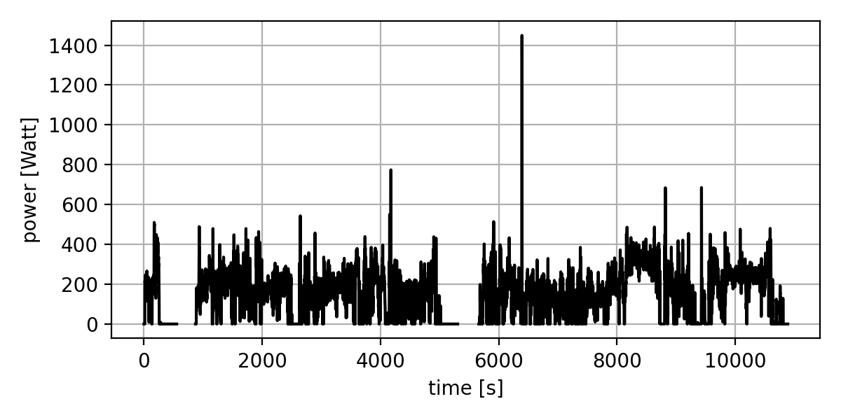
This was a relatively easy ride, with a sprint half-way through and a ~10-minute threshold effort after about 2 hours of riding.
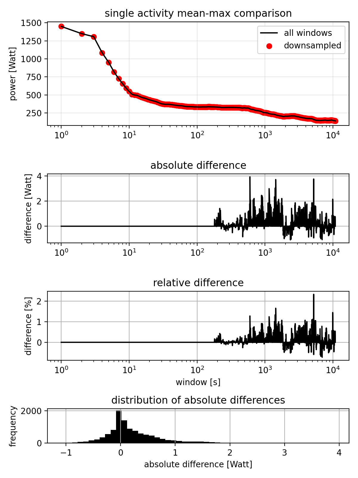
The comparison shows:
- Top panel: Red dots (sampled) overlaid on black line (full calculation)
- Second panel: Absolute difference in watts
- Third panel: Relative difference as percentage
- Bottom panel: Distribution of absolute errors
The mean-max plot at the top shows that the data for both methods is at least visually indistinguishable. The plot of absolute differences show that errors only occur at durations > 180s (which is expected, since we only downsample for durations > 180s) and the maximum error is about 4W at about 10 minutes (600 seconds): Not perfectly precise, but not terrible either. The relative differences paint a similar picture. The histogram shows a quite narrow distribution of errors, with most errors being less than 1W.
Longitudinal analysis
Looking across 8 months of cycling data, the pattern is not too different:
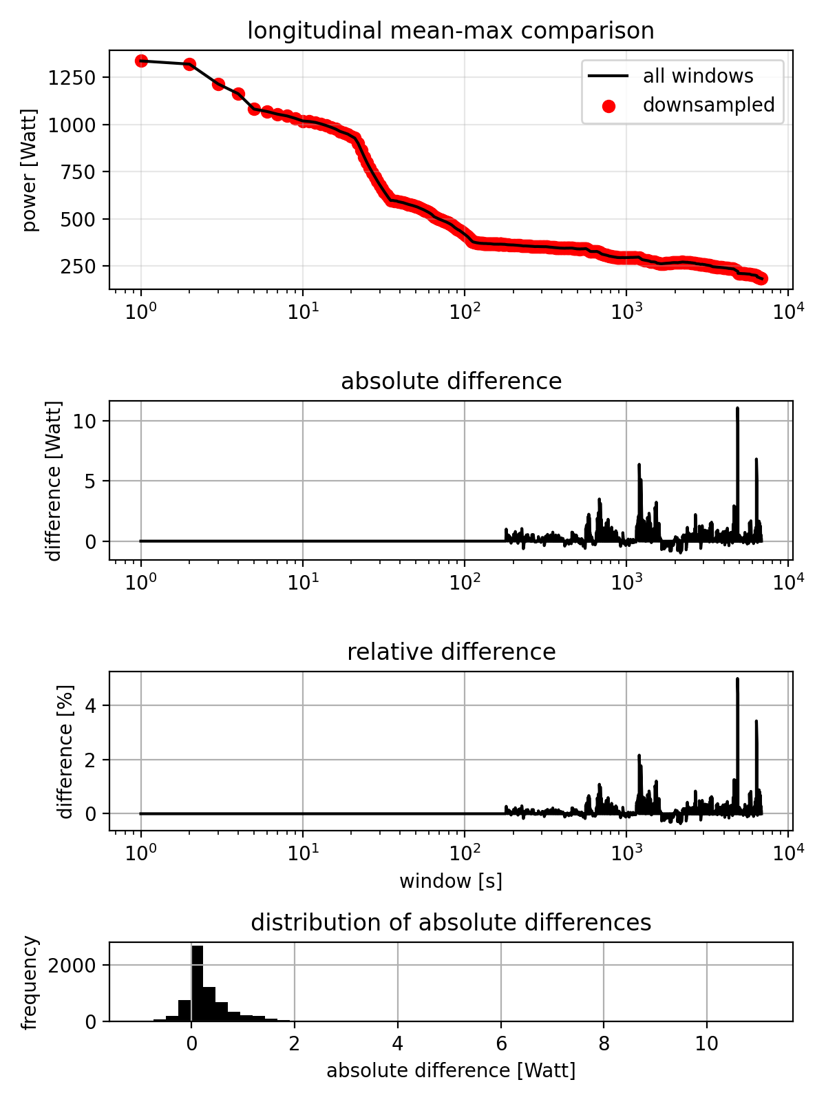
The dataset-wide mean-max curve is (expectedly) smoother than the single activity curve, since it’s the average of many activities and both curves are (again) visually indistinguishable. The absolute and relative differences show that there are some cases where the error is larger, but overall the pattern is similar. The distrubution shows that almost all errors are within -1 and +2W, with outliers up to 10W.
Linear vs step interpolation
The step-interpolation predictably underestimates the actual mean-max curve. For comparison, I’ll also provide the results for linear interpolation between sample points:
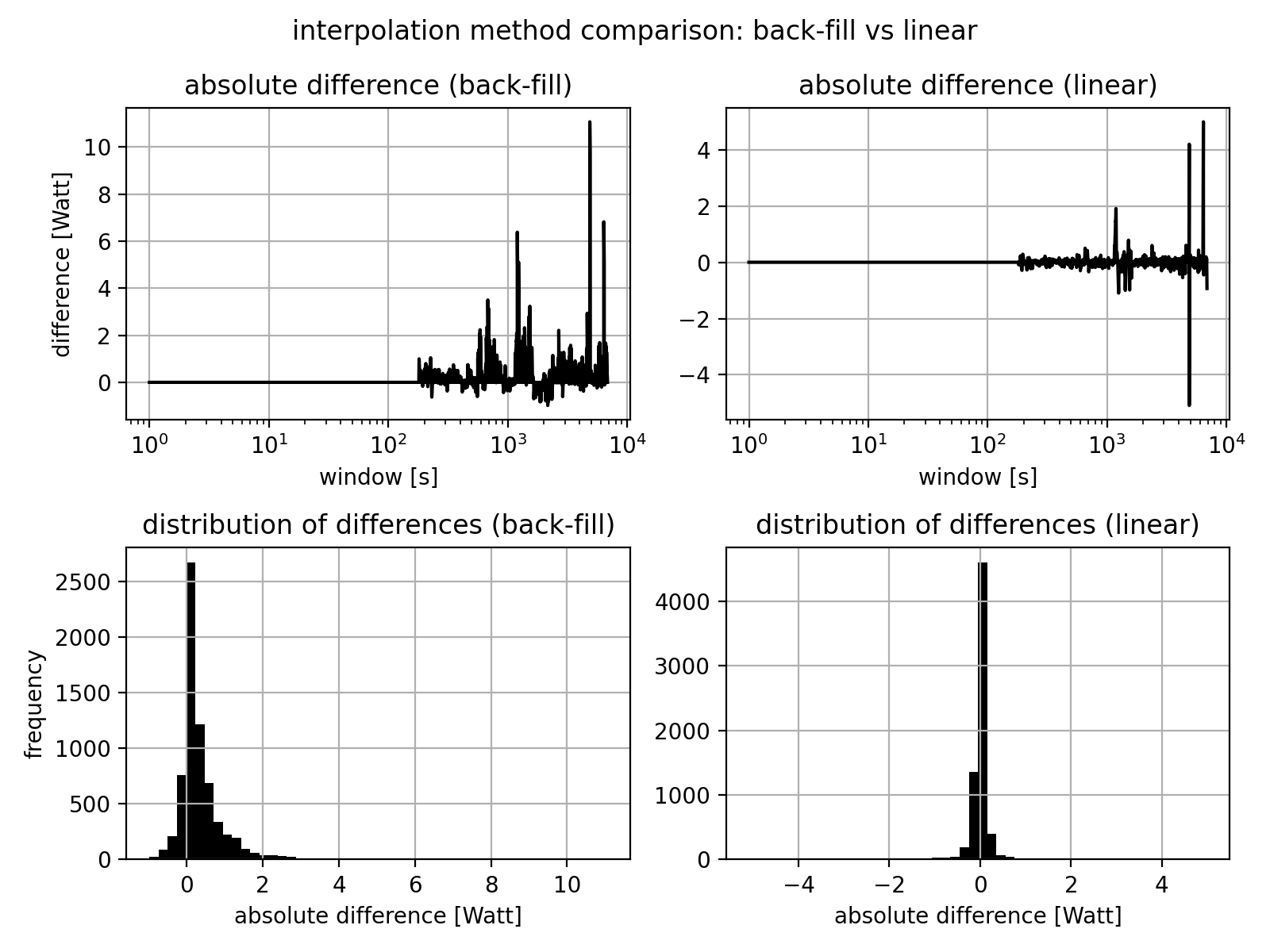
The results show that the mean and maximum errors are much smaller for linear interpolation.
Discussion
The sampling approach seems to provide a very good approximation of mean-max curves with potentially significant computational savings. The errors introduced with the proposed sampling strategy in combination with step interpolation are not expected to be significant for most applications like power duration modelling.
Code
The complete script for this analysis is available here. The script includes the code to load the data from SweatStack, the sampling logic, comparison functions, and code to generate the plots in this post.